Matrix Analysis
Overview
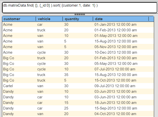
A matrix report is a common way to roll up values based on a dimension. Consider the following query and sample data from the Qarbine “Sample Data Service” endpoint.

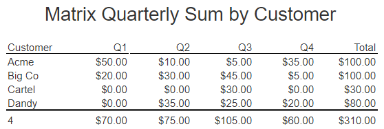
A sample matrix result is shown below.

In this example we are rolling up sales by customer based on the quarter in which a sale took place. It is in the catalog at “example/Macro functions/Matrix Quarterly Sum Report”.
Template Definition
Overview
The first step is to define the query so that the data being processed is in the correct order. In our example we sort the sales information based on the customer and then date. The sample query is shown above.
This example can be found in “example\Macro functions” folder in the template named
“Matrix Quarterly Sum Report”.
The next step is to define the value for the first column which is the context for the rolled up value to the right. In this case each row represents a customer. This maps to the ‘customer’ field of the data. Using the ‘#’ field notation the cell formula would be
#customer
The next step is to define the cells moving to the right. In our example we want to rollup sales based on the quarter (1 through 4) in which the sale occurred. For example purposes our sample data is all within the same year. We can obtain the quarter in which a date falls using one of Qarbine’s many macro functions
dateProperty(#date, "quarter")
For the analysis we are also going to compute:
- the total across each customer row
- the total for each quarter
- the grand total of sales
Layout Definition
The overall layout is depicted below.

The report header is a standard one and the group header provides the labels above the data of interest.
The key to building this matrix report are the body cells. The first cell sets up the row context being the customer name. The first cell formula is
customerName = matrixContext(#customer)
The matrix context is used along the other cells to the right to provide when to continue to roll up values. In this example we are summing up the sales by quarter while the customer matches that of the first cell.
The first rollup cell has the following formula
q1 = matrixSum(#customer, dateProperty(#date, "quarter") == 1, #quantity, 0)
The first argument is used to match the value set on the first cell. In this case the customer name for which we are summing sales across the row. That is the first criteria to continue to perform the matrix sum operations.
The second matrixSum() argument corresponds to the column’s criteria to continue to sum the value of the third argument. For example as long as the customer is ‘Acme’ and the sale date falls in quarter 1 then continue summing the quantity values. Bear in mind there will be cases where sales fall in only quarter 1 and 3 for example. In this case the formula result will be the sum for quarters 2 and 4 are both zero. It is imperative the data is sorted in a manner that aligns with how the matrix macro functions are defined.
The second rollup cell has a similar pattern as shown below
q2 = matrixSum(#customer, dateProperty(#date, "quarter") == 2, #quantity, 0)
Ditto for the third and fourth summation cells.
As the body line template cells are processed left to right the variables q1, q2, 3, and q4 have values assigned. To their right is a row total cell formula defined as
total = @q1 + @q2 + @q3 + @q4
The 1.1 group summary cells begin with a count cell
Position: 0 - 10 Formula: = count(@customerName)
Justification: Left
Border: T
The next 4 cells sum each quarter.
Position: 11 - 19 Formula: = sum(@q1)
Justification: right  Formatter: currency Default
Border: T

Position: 20 - 29 Formula: = sum(@q2)
Justification: right  Formatter: currency Default
Border: T

Position: 30 - 39 Formula: = sum(@q3)
Justification: right  Formatter: currency Default
Border: T

Position: 40 - 49 Formula: = sum(@q4)
Justification: right  Formatter: currency Default
Border: T
Finally we also sum each row’s total value as an overall total.
Position: 50 - 59 Formula: overallTotal = sum(@total)
Justification: right  Formatter: currency Default
Border: T
With this layout and cell definitions the output from this template is shown below.

Adding Heat Map Feedback
Overview
A heat map can be used to provide visual feedback on how one value relates to another. In this case we want to see how a particular customer’s sales in a quarter relate to the overall sales for the year. Below is a sample result which highlights values based on percentages of overall sales.

This example can be found in “example\Macro functions” folder in the template named
“Matrix Quarterly Sum Report with heat map”.
Layout Definition
The overall layout is depicted below.

The cells to the right of the first set of Q1 through Q4 cells are
The heatmap colors are based on the maximum sale value for any quarter. The first cell above resides on a report header line and sets the maximum quarterly variable (qMax) value to 0. These cells use twoPass() macro functions to gather a value during the first pass of the template and then perform another calculator after that. This is necessary because we are using the maximum quarterly sale value as part of the 2nd pass formula. We do not know that value until the first pass has completed.
The pattern these cells follow is
= twoPass(@q1, @cellValue/@qMax )
The first argument is the expression to obtain the first pass value. The second argument is the expression to evaluate during the 2nd pass. The ‘@cellvalue’ represents the cell’s value from the first pass. Each of these Q1-Q4 percentage cells also has the following color formulas.
The formulas are evaluated during the second pass to determine the cell’s background and foreground colors. In this case we are using the default color span spectrum of red through blue. A low value shirts toward red and a high value shifts to blue.
To the right of the quarterly percentage twoPass() cells is the formula
qMax = maxOf(@q1,@q2,@a3,@q4, @qMax)
This tracks the maximum quarterly summation value during the first pass across each customer quarterly value and saves it in the qMax variable. That value is later used in the 2nd argument expression of the twoPass() cell formulas
= twoPass(@q1, @cellValue/@qMax )
The twoPass cell formula determines the percentage that cell is relative to the maximum quarterly sale summation value. That value is then used as input to the background and foreground color value formulas.
Sample results are shown below.

In this case we chose to use the heatmap concept for coloring the percentages. Similar color variations could be done for the values relative to the grand total.
Additional Examples
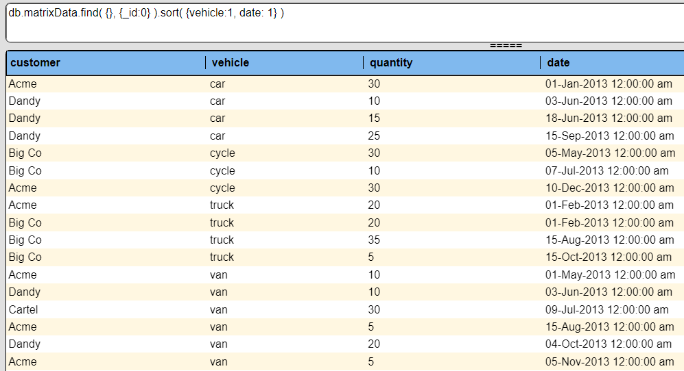
Consider the data below sorted by vehicle rather than customer as was shown at the beginning of this document.

This can be rolled up into a matrix report as shown below.

This example is in the catalog at “example/Macro functions/Matrix Quarterly Sum Report Vehicle”.