Prompt Designer Guide
Overview
Prompts mainly act as dialogs to obtain runtime values from users. The variables defined in the prompt may be referenced by data sources and report templates. This allows greater flexibility for your data retrieval queries and report templates. Shown below is the execution flow when there is a Prompt component.

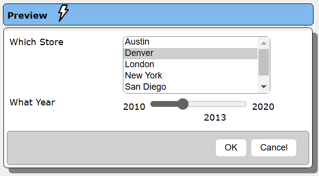
For example, you may prompt the user for which store location to perform an analysis on and for what year. Here is how it may appear to the user.

In this example, there would be a prompt component with 2 elements. The first would obtain the store reference value and the second the year value. A data source would then have a query with placeholders for these variables. These placeholders would be replaced by the prompted values and then the query would be run. The variables from a prompt can also be used in a template.
Opening the Tool
You can access the Prompt Designer in several ways. Tools can be opened from the signOn page, the home page, and from various tools using the hamburger  menu.
menu.
From the Home tool.
Alternatively you can open the tool from the hamburger menu on each tool.

. . .

Pressing the control key during the menu click opens the tool in another tab.
Sample Prompt
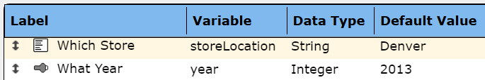
For example, you may prompt the user for which Store to perform an analysis on and for which year. In this example, there would be a prompt component with 2 elements. The first would obtain the store reference value and the second the year value. A data source would then have a query with placeholders for these variables. These placeholders would be replaced by the prompted values and then the query would be run. A listing of the prompt elements is shown below.
The variables from a prompt can also be used in a report template. For example, you could prompt for a rate increase factor and then use that variable in your "what-if" calculations.
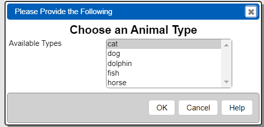
Here is how a prompt may appear to the user.
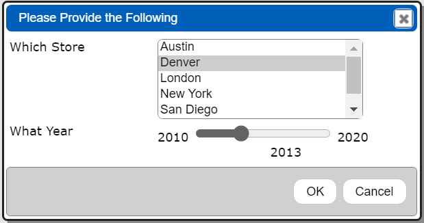
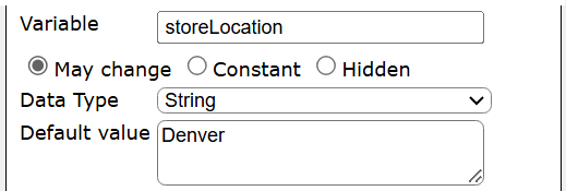
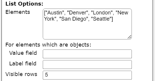
The list of selectable store names may be hard coded using this short-cut expression.
["Austin","Denver","London","New York","San Diego","Seattle"]
The following are example definitions for each of the elements. A sample store location element definition items of interest are.

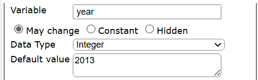
A sample year element definition items of interest are.


Here is how a data source may then use that runtime variable to find all of the sales for the chosen store.
retrieveData("Default Data Service", null, "db.sales.find(
{storeLocation: [! @store !], saleDate: [! inYearCriteria(@year) !] } )",
"sample_supplies")';
The ‘[!’ sequence is the leading delimiter to the placeholder and ‘!]’ the trailing delimiter. The content is a Qarbine macro expression.
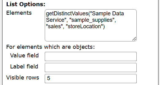
The list of stores may also be obtained dynamically from a database.
getDistinctValues("Sample Data Service", "sample_supplies", "sales", "storeLocation")
The first element definition would then be the following.
Tool Work Areas
The Prompt Designer has the following columnar areas.
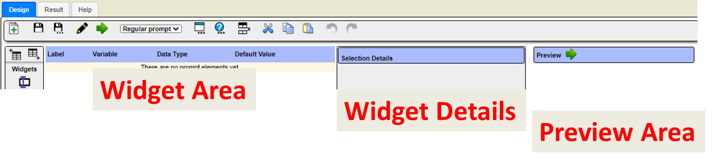
The left hand side of the window is segmented as shown below.
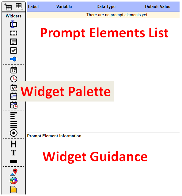
Widget Palette
The following widgets are available from the palette in the left hand sidebar area. Their availability varies based on Qarbine edition, release, and other variables.
| Widget | **** | Widget | |
|---|---|---|---|
 | Entry field |  | Date |
 | Hidden entry field |  | Time |
 | Text area |  | Date and time (timestamp) |
 | Checkbox |  | Date range |
 | Slider |  | Timestamp range |
 | Drop down |  | Heading |
 | List- single or multiselect |  | Label |
 | Radio box set |  | Horizontal line |
 | Color |  | File prompt |
 | Geographic location and radius |
Selecting the widget in the palette displays guidance information to the right. Shown below is information on the entry field widget.

Initially the prompt has no user input elements.

To add a widget to the prompt elements list you can either:
- double click the in the palette,
- drag and drop the widget icon, or
- use the pop up context menu.
The widget area’s pop up menu is shown below.

The prompt elements can be reordered in the list by dragging them upward and downward using the left hand up/down arrow icon.
Prompt Element Details
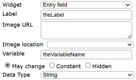
Each prompt element widget has varying properties which can be set. Most have data type and default value fields such as shown below.
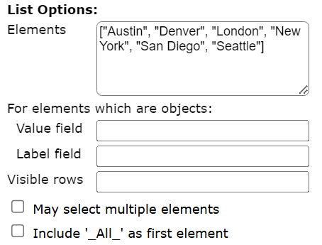
The list widget then includes additional settings such as those below.
When changes are made to the prompt element the top area icon will be changed from

to

You have to exit out of any entry field for the change to be noticed. Click  to save the element and update the sample overall prompt to the right.
Once saved the preview area will be updated.
Running Your Prompt
To run your prompt click  .
.
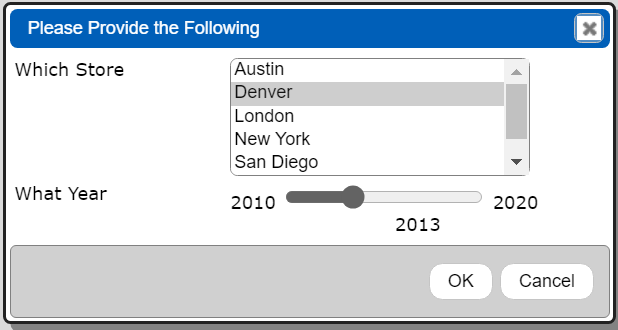
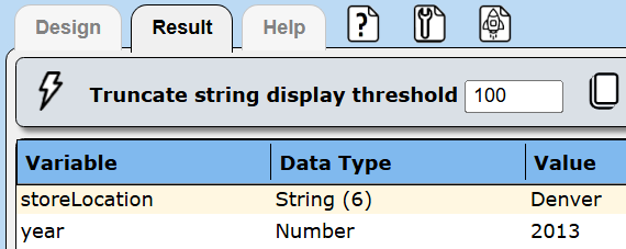
The dialog shown includes the title bar area as well. Clicking OK shows the resulting variable values.
Activate the Design tab.

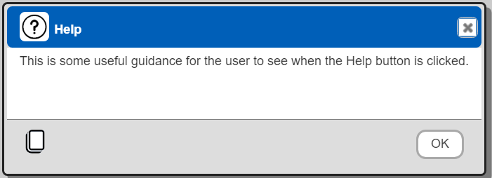
You can include a Help button by clicking the  toolbar icon to access the properties dialog.
Activate the Help tab.

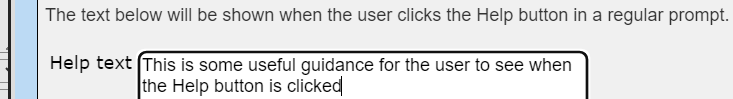
Enter the help text in the text area.
Close the properties dialog by clicking

The button area will then show the Help button.

Running the prompt and clicking it shows a dialog.
Widget Options in More Detail
Entry Field
This is a general input field. You can specify the default value using an expression. The input strings may be converted into several common data types based on the "Data Type" drop down value. A sample is shown below.

String input provides entry field guidance and is used as needed based on the data type.
Hidden Input
This widget is used to set a constant variable value which flows onward in the execution flow. The user is not presented with any way to change its value. One use would be to propagate the signed on account name or other variable which can be used in setting placeholder values in queries or formatting template output.
Text Area
This widget is useful to obtain free form text that may be included in template results. For example, a comment about the purpose of the analysis about to be run. A sample is shown below.

 Checkbox
The checkbox is used to obtain a true or false value. A sample is shown below.

Slider
This widget is used to obtain a numeric value from a numeric range. The data type must be either Decimal, Integer, or Number. A sample to prompt for a number between 1 and 10 is shown below.

For HTML prompts, you may specify a default value which is a list of 2 values. For example,
listWith(3, 7)

The values are the initial minimum and maximum values and indicate to use a range slider. The resulting values are stored in {variableName}Start and {variableName}End.
Drop Down
This widget occupies a single line and shows the use a list when clicked upon. The list's contents is defined by the "Elements" expression. If the values are simple strings, then an expression such as the following can be used.
listWith("red", "green", "blue")
A sample is shown below
 .
.
You can also populate the list by referencing a data service and specifying a query. For example, for a list of clients in the portfolio collection the following can be used,
The widget's "Key field" would be "_id" and the "Label field" would be "name".
List
This widget displays multiple rows from which the user may choose. The list's contents is defined by the prompt element's "Elements" expression. A sample is shown below.

If the values are simple strings, then an expression such as the following can be used.
listWith("red", "green", "blue")
You can also populate the list by referencing a data service and specifying a query. For example, for a list of clients in the portfolio collection the following can be used,
In this example the widget's "Key field" would be "_id" and the "Label field" would be "name". If there are many possible choices or the number of characters in the choices is large, then the list widget is likely a better way to go.
Radio Group
The radio group requires a list of values from which the user chooses one of. That list is defined by the "Elements" expression. If the values are simple strings, then an expression such as the following can be used.
listWith("red", "green", "blue")
A sample is shown below.

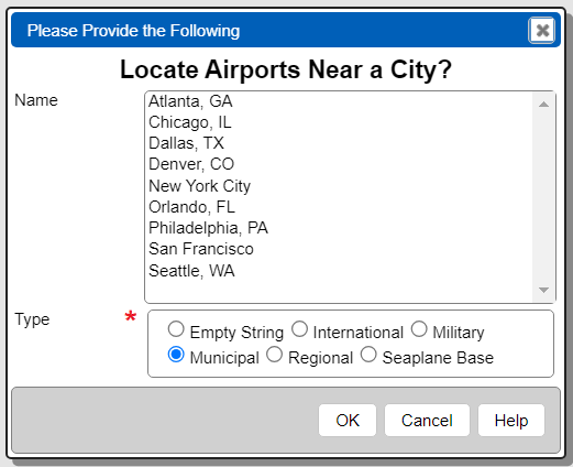
You can also populate the list by referencing a data service and specifying a query. For example, for distinct airport types in the airports collection the following can be used,
listFromField(retrieveData("Sample Data Service",
 "db.airports.aggregate( [  {$group:{_id: '$type'} },{$sort:{ '_id':1 } } ]) "), "_id")
If there are many possible choices or the number of characters in the choices is large, then the list widget is likely a better way to go.
Heading
This widget is for one line text that uses a larger font than labels. You may optionally bold and center the text. The differences between a heading and a label are shown below.

Label
This widget is for one line of text. You may optionally bold and center the text. The differences between a heading and a label are shown above.
Separator
This widget draws a horizontal line across the input form. It is useful for visually separating various form areas. A sample separator is shown below.

Date
This widget obtains a date value. A sample is shown below.

Time
This widget obtains a time value. It is a string value such as '18:30'. A sample is shown below.

Date and Time
This widget obtains a date+time value. A sample is shown below.

Date Range
This widget obtains a beginning and ending date. A sample is shown below.

If the element's variable name is salesDate, then the resulting variables are salesDateBegin and salesDateEnd.
Date and Time Range
This widget obtains a beginning date+time and an ending date+time. A sample is shown below.

If the element's variable name is salesDate, then the resulting variables are salesDateBegin and salesDateEnd.
Color
This widget prompts for a color value. The result value is a hexadecimal color value such as #000000 for black, #FF0000 for red, and #FFFFFF for white. An example is shown below.
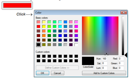
Clicking on the widget presents the color dialog shown on the right.This widget prompts for a color value. The result value is a hexadecimal color value such as #000000 for black, #FF0000 for red, and #FFFFFF for white. An example is shown below. Clicking on the widget presents the color dialog as shown above.
Map
This widget provides a button on the input form which opens a geographic map dialog. Within the dialog you specify a center point and a radius. The result value is an object with latitude, longitude, radius, and zoom fields. The variable can be used within a query. An example using a MongoDB query is shown below which uses the special query escape notation "[! expression !]" for placeholder replacement.
db.airports.find( { loc : {$near : {$geometry : {type : "Point" ,
coordinates : [[!@where.longitude!], [!@where.latitude!]] },
$maxDistance : [!@where.radius!]} } } )
An example is shown below. Clicking on the button presents the dialog shown on the right.
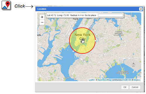
See the tutorials sections for Geospatial Querying and Maps for more details.
File
This widget prompts for a local file. The local file's contents are then read and used as the variable value. The file may contain JSON data. Choosing the 'Data type' of 'JSON' will automatically convert the JSON string into a JSON object. The variable value is that JSON object. A sample is shown below.

Note- If the object has a 'moveValuesUpward' value of true, then the JSON object's fields are treated as individual variable values. This is useful to test templates which have many variables that would normally come from a complex prompt definition. Instead, the template can reference the prompt which uses a file to populate the variable values. This avoids manually entering values each time the template is run. A simple example of such JSON is below
{"foo" : 123, "bar" "Hello world", "moveValuesUpward": true}
sets the variables foo and bar.
The Input type provides options to treat the file's contents as a string, to convert it to base 64 format, or to have the variable be a buffer. The base 64 option can be used to propagate the value to downstream services such as image embeddings.
Default Values
The default values may be hard-coded values or a macro formula. Each type of widget accepts a default value. The drop down, list, and radio group widgets require a list of values to populate properly. You can specify a value of ‘first’ or ‘last’ as the default value and the first or last element respectively of the list will be used as the default value in the widget..
More Examples
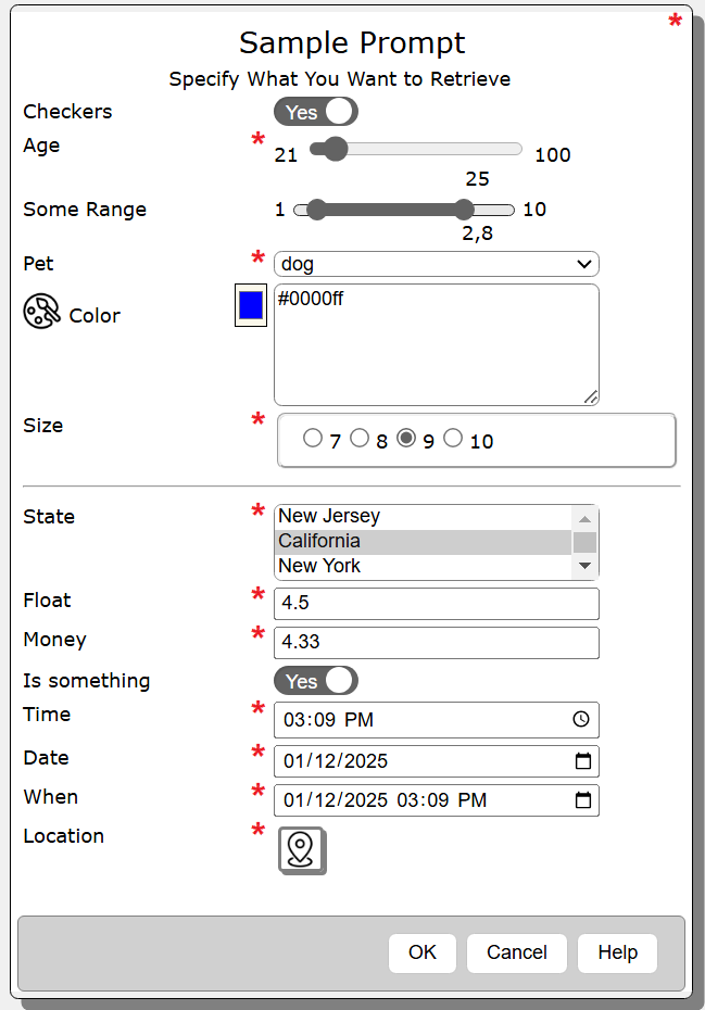
The Kitchen Sink
Selection List with Help Button
Selection List and Radio Group